
Eurovision Song Contest Unveils Brand Refresh Ahead of 70th Anniversary Celebration
AUSTRIA – The Eurovision Song Contest, the world’s largest live music event, is preparing for its 70th anniversary edition in 2026 with a striking new brand identity. Organizers announced that fans will begin to see the refreshed look immediately across digital platforms, featuring new logos, fonts, and vibrant visual assets to mark the milestone year.
A Playful Yet Elegant New Look
The updated brand emphasizes a playful and elegant design, introducing a smoother cursive “E” in the Eurovision Song Contest logo along with a new custom-made typeface called “Singing Sans.” These elements aim to give the contest a modern, unified appearance across both digital and live formats while retaining the instantly recognizable Eurovision character.
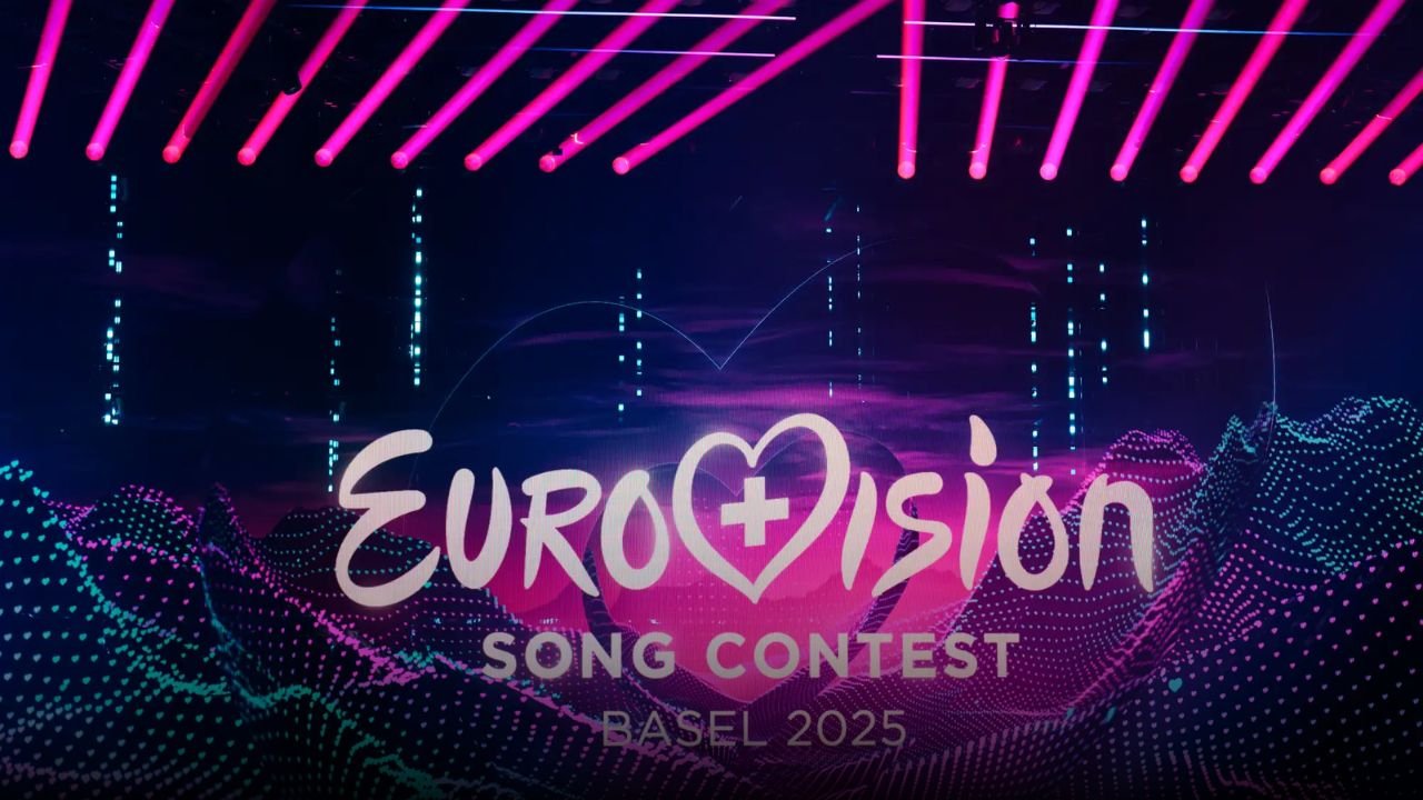
The simplified logo builds upon the hand-drawn script first introduced in 2004 and refined in 2014. At its center remains the iconic Eurovision heart, symbolizing the contest’s enduring theme of being “United by Music.”
The Beating Heart of Eurovision
A major highlight of the refresh is the unveiling of the “Chameleon Heart,” a dynamic graphic asset described as the contest’s “emotional compass.” This design absorbs cultural influences and adapts to reflect the host country’s identity, a performer’s personality, or a theme, while always staying true to the Eurovision spirit.
For the upcoming milestone year, a special 3D anniversary logo has been created: a heart composed of 70 unique layers, each representing one year of the contest’s remarkable history. This emblem will be central to all promotional campaigns leading into the 70th edition of Eurovision in Austria in 2026.
Honoring 70 Years While Looking Ahead
The rebrand was developed by the European Broadcasting Union (EBU) in collaboration with UK-based studio PALS, which previously worked on the Liverpool 2023 Eurovision strategy.
Martin Green CBE, Director of the Eurovision Song Contest, emphasized that the new design is about both honoring the past and preparing for the future:
“The Eurovision Song Contest has always been about evolution – musical, cultural, and creative. This refresh honors 70 amazing years while taking the brand forward to an exciting future. It’s bold, playful, and full of heart – just like the Contest itself.”
Green also noted that the refreshed look will make the Eurovision identity clearer across platforms, unify its family of projects, and strengthen the brand globally as the contest continues to expand its audience worldwide.
Looking Ahead to Austria 2026
As anticipation builds for Austria’s hosting of the 70th edition, fans can expect to see the brand identity rolled out more broadly in the months ahead. Organizers hinted at additional surprises and special events to celebrate seven decades of Eurovision history, ensuring that the anniversary will be one of the most memorable in the contest’s history.
With its refreshed logo, new typeface, and the symbolic Chameleon Heart, the Eurovision Song Contest is preparing to celebrate not only its remarkable legacy but also its enduring ability to bring nations together through the power of music.
For more updates on the Eurovision Song Contest and other major music events worldwide, visit ChicagoMusicGuide.com.